Copdro: A Refined Display Font for Digital Branding
It started with a hero section—just me, a half-finished boutique coaching site, and a nagging sense that the headline felt… safe. Too safe. I swapped in Copdro on a whim while testing contrast over a soft gradient background, and suddenly the whole layout exhaled. The headline didn’t just sit there—it anchored the page with quiet confidence. That’s when I knew Copdro wasn’t just another display font; it was a subtle but powerful tool for shaping how visitors first experience a brand online.
What Makes Copdro Stand Out in Web Layouts
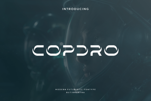
Copdro is a premium display font built for impact without shouting. Its smooth angular shape walks a graceful line between modern geometry and elegant restraint—no sharp edges, no exaggerated curves, just clean precision with warmth. It’s not minimalist to the point of sterility, nor decorative to the point of distraction. In practice, that means it scales beautifully: crisp at 80px on desktop hero banners, still legible and intentional at 42px on mobile viewports, and effortlessly balanced when set against neutral or textured backgrounds.
I tested it across three real layouts: a product landing page for a digital course, a portfolio homepage for a ceramicist, and a seasonal campaign banner for a small-batch skincare brand. In each case, Copdro elevated the perceived value—not by adding ornament, but by reinforcing clarity and intentionality. Users don’t read “Copdro” as a stylistic choice; they feel its effect as trust, polish, and thoughtful design.
Where Copdro Shines (and Where It Steps Back)
Copdro thrives where attention matters most: hero headlines, section titles, call-to-action buttons, logo lockups, and branded graphic elements like quote cards or testimonial highlights. On the course landing page, pairing Copdro Bold with a light-weight sans serif body font created instant visual hierarchy—scanners landed on the promise (“Transform Your Practice in 6 Weeks”), then flowed naturally into supporting copy.
But here’s what I learned through testing: Copdro isn’t meant for long-form reading or functional UI text. I tried it for navigation labels and form placeholders—too delicate, too low-contrast at small sizes. It also needs breathing room: avoid tight letter-spacing or stacking it over busy image overlays without sufficient contrast or a subtle drop shadow. For accessibility, always pair it with a highly legible sans serif (think Inter, Poppins, or even system fonts like -apple-system) for all body, caption, and interface text.
Responsive Behavior and Real-World Readability
One of my favorite discoveries? How gracefully Copdro handles responsive shifts. At tablet width, I reduced the hero headline from 72px to 56px—and instead of looking thin or fragile, it retained its structural integrity. The smooth angular terminals hold up well on both retina and standard displays, and hinting in the webfont files ensures consistent rendering across Chrome, Safari, and Firefox.
On dark mode previews, I added a subtle 1px white stroke via CSS text-stroke for extra definition—just enough to keep it readable without compromising elegance. For image overlays, I used a semi-transparent dark gradient behind the text block rather than relying solely on font weight. Copdro’s open counters and generous x-height mean it doesn’t vanish on lower-resolution mobile screens, even when placed over subtle photography.
Smart Pairings and Practical Implementation Tips
Font pairing is where Copdro truly reveals its versatility. With a warm, humanist sans serif like Lato or Nunito, it feels approachable and grounded. With a refined serif like Cormorant Garamond, it leans into editorial sophistication—ideal for blog headers or newsletter banners. And yes, it even works alongside a restrained script for accent phrases (e.g., “Handcrafted with care” beneath a Copdro logo), as long as the script remains subtle and secondary.
Before deploying, I checked the included webfont formats (.woff2 recommended), confirmed multilingual support covered my client’s European audience, and verified commercial licensing allowed use on client sites and SaaS dashboards. No ligatures or stylistic alternates cluttered the set—just clean, purpose-built weights (Light, Regular, Bold) that load fast and render predictably. That simplicity is a feature, not a limitation.
Using Copdro Beyond the Hero Section
Don’t stop at headlines. I used Copdro for a sticky “Join the Waitlist” CTA bar—its angular rhythm made the button feel more intentional, less generic. On a portfolio grid, it styled project category tags (“Ceramics • Studio • Limited Edition”) with quiet authority. For email header graphics, it held up perfectly when exported as SVG, retaining sharpness at any scale.
It also works surprisingly well for micro-branded moments: a small “Est. 2021” footer tag, a discreet “Free Shipping” badge beside a price, or even stylized numbers in a timeline section. Just remember—Copdro earns its place through brevity and context. Three words? Perfect. A full sentence? Consider tightening or switching to your body font.
If you’re refining a brand’s digital presence—whether launching a new service, refreshing a portfolio, or building a high-conversion landing page—Copdro offers something rare: distinction without distraction, elegance without effort. It doesn’t scream for attention. It simply makes everything around it look more considered, more cohesive, more like it belongs.